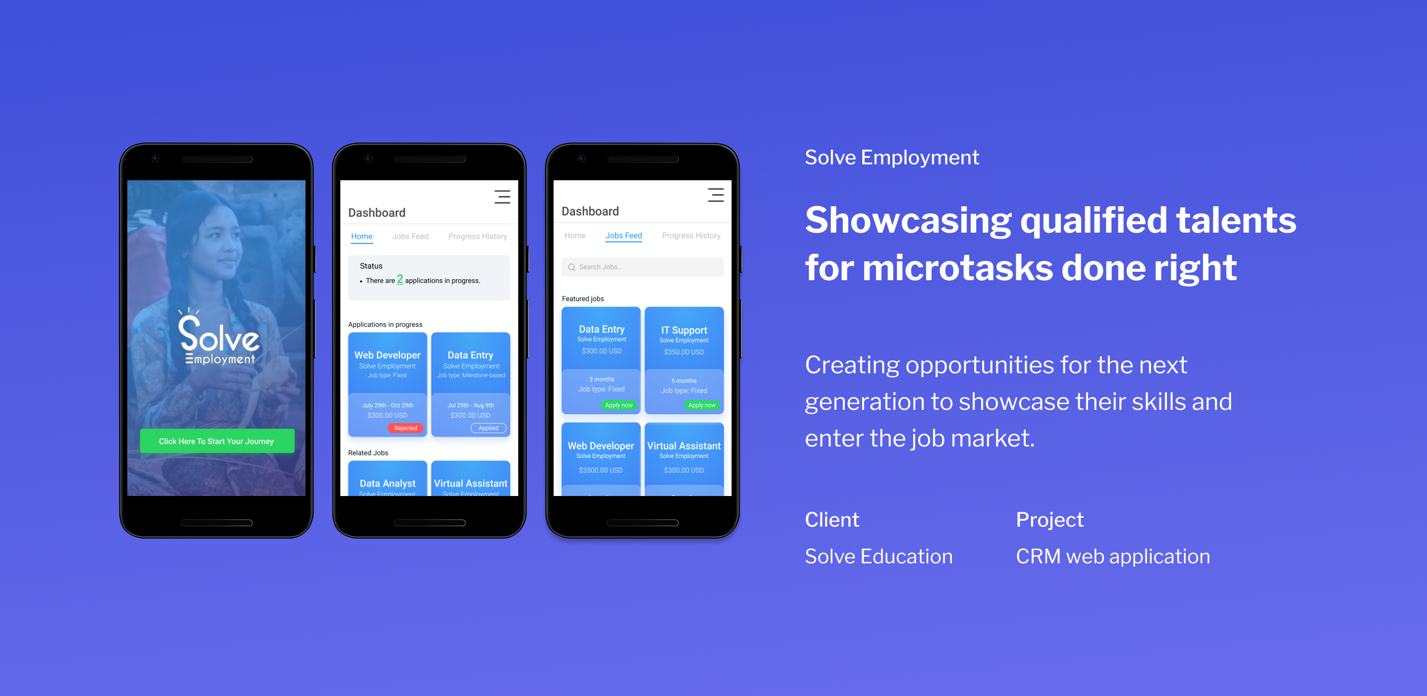

Solve Employment is a CRM platform providing talents with job opportunities. The platform enables talents to complete micro tasks online as well as receive payment for their services.
The collaboration with Solve Employment began with an introduction kickoff meeting and stakeholder interview to learn about user issues on their current web application. Talents (applicants) and employers have a difficult time navigating throughout the web application and resolving disputes related to wages and work performance. Talents also get confused about where they can go to view progress of their job application(s), job(s), and dispute(s).
Solve Employment aims to increase job opportunities for the next generation in Indonesia and neighboring countries. Three teams with nine UX designers each were given the opportunity to improve the user experience of the current hiring web application. My team of nine UX designers further split into 3 groups to focus on each user type: the admin, talent, and employer. Our subgroup focused on understanding the needs of talents and creating a seamless web and mobile experience for searching job and completing work.

The Solve Employment platform gives marginalized youth access to perform microtasks such as labeling, virtual assistants, indexing, customer service, and so much more. Employers can hire applicants from the platform, assign tasks, review tasks, and pay the applicant all through the Solve Employment web application. The goal of Solve Employment through gamification is to prepare marginalized youth for the competitive job market by creating opportunities on their platform to get hired and complete microtasks or internships.

Our team’s redesign process began with a heuristic analysis of the current Solve Employment web application. The stakeholders granted us login privileges to explore and input test data such as applying to a job or posting a job. We also mapped out a user flow of the current web app and based on the documentation provided by the stakeholders. After reviewing the documentation, our subgroup created a user flow of the features we delegated to one another. I primarily focused on designing a status notification card, progress history, disputes, uploading task files, and other tasks related to monitoring their job. We used Trello board to delegate tasks and give feedback to each other.
Since the stakeholder granted us complete creative freedom, the team decided to create a new design system that will enhance the user experience of the web app. We began with analyzing colors, identifying competitors, and learning about Indonesian culture and business etiquettes. Indonesians enjoy learning about their business partner(s) before steering into business conversations. When it came to culture, “yes” in Indonesia could translate to different things and they rarely say “no.” This part was really crucial to understand and keep in mind when designing because disputes between talents and employers was one of the main conflicts presented by the stakeholders.

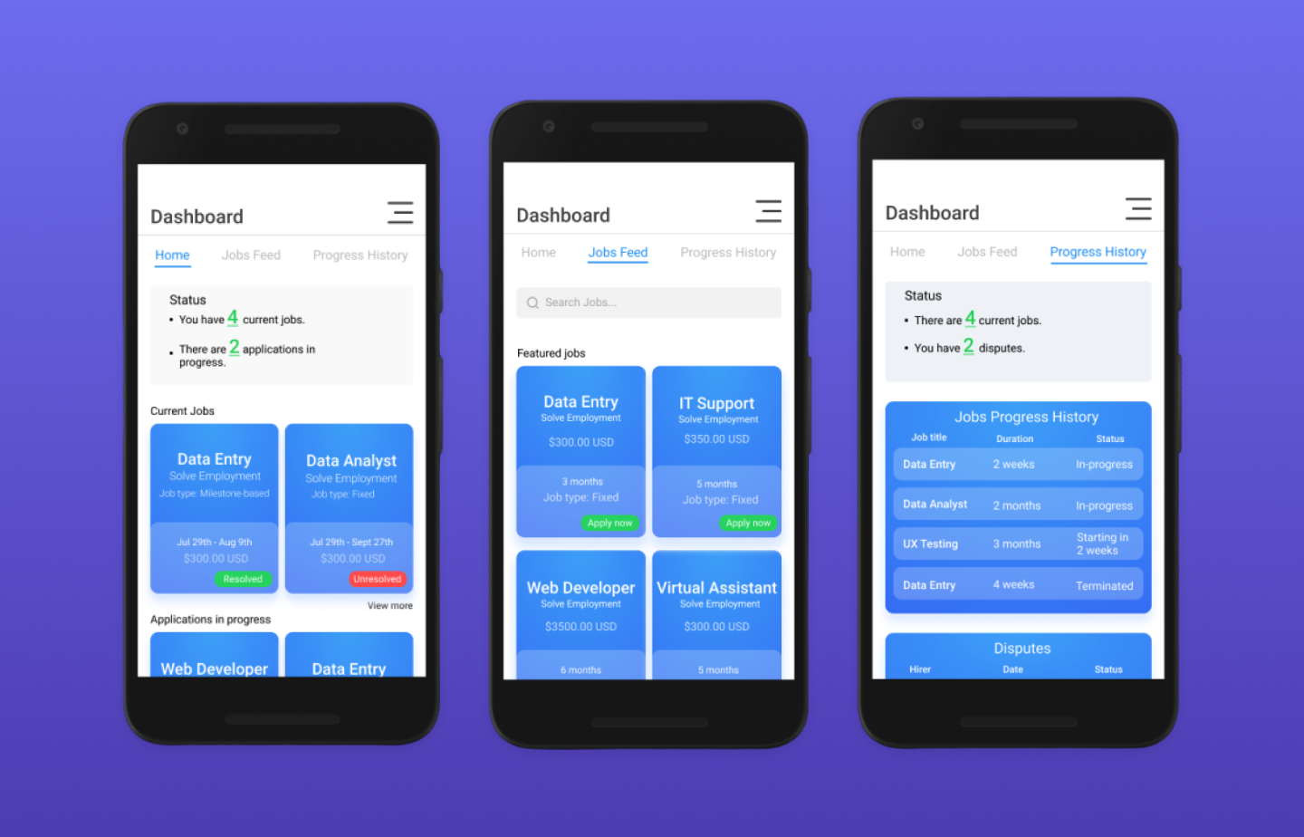
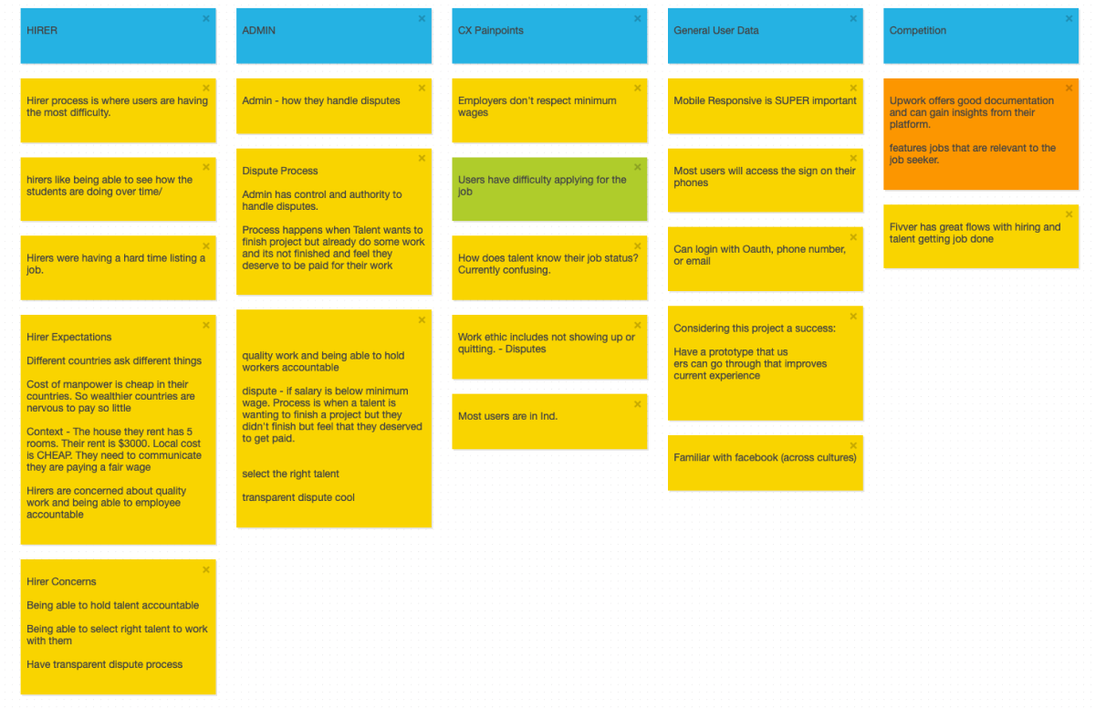
Our team used Stickies.io to identify and categorize user issues on the current platform. Mapping out the user pain points helped the team to prioritize issues and design effective solutions. The talent team began to wireframe low fidelity mockups in Figma using our new design system. The status screen at the top of each new screen was inspired from design research and resonated from the issue of talents wanting to easily view notifications and status regarding job applications, disputes, current jobs, and earnings.

The current Solve Employment web and mobile application implemented a table view layout to display most features. The table layout contained lots of information but made it difficult to understand especially when viewing the dashboard from a mobile device. Based on the stakeholder interview we learned that most of the talents accessed the Solve Employment application from an android device.
When designing, we took a mobile-first approach and kept in sight, notes from the stakeholder interview. This key information led us to the decision to design a card layout for the redesign. The card layout enabled the team to display at-a-glance information to where the talent can quickly skim and understand details of current job, disputes, or view progress of current jobs and applications. The colored indicators on the card notify talents the status of disputes and application status.


After designing with a team of 7-8 designers on a single project, I learned how much communication, feedback, and sharing reasoning behind design elements affect team cohesion and design decisions. Initially, design was difficult to communicate verbally. When we had ideas on certain features, sketching out a quick design helped other designers to visualize and understand the reasoning. Drawing quick sketches and creating mid-fidelity designs helped to speed the design process and quickly create high-fidelity mockups.
At the end of the two weeks, our team presented our design, screen recordings, and Figma prototype to the stakeholders. The stakeholders liked the dashboard layout with a menu that talents can tab through to take a quick glance and view applications, work progress, and disputes. We resolved the main issue that was presented to us which was enhancing the user experience and a feature to ease the process of viewing status. The status element at the top of each screen in the dashboard layout and other screens notify talents of important information.
I enjoyed the opportunity to collaborate with Solve Employment to improve the user experience of their web application and to be part of an incredible vision of increasing access to quality education through gamification.